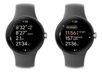
The previous Pixel Watch workout UI, while functional, wasn’t ideal. A single large metric dominated the screen, with three smaller stats crammed below. However, with the new update that — according to 9to5Google — is rolling out now, Google has abandoned this in favor of a layout that is more user-friendly and straight from the Pixel Watch 2.


New OG Pixel Watch Fitbitworkout UI based on Pixel Watch 2 | Source: Google
Now, your key exercise stats are displayed in a vertical list that you can easily swipe through. This provides a much clearer view, allowing you to check things like heart rate, calories burned, and elapsed time at a glance. This will definitely be more helpful while in the middle of a workout.
Heart rate zones also get a cool visual representation: a filled-in heart icon. Other subtle tweaks are also present, such as a change in the shape of the end, resume, and lock buttons, which are now pills instead of circles. These small changes add to the polish of the new UI.
These changes arrive via Fitbit 3.19 for Wear OS, which you’ll likely find waiting for you on the on-watch Play Store. There is one quirk that 9to5 mentioned regarding this update, and that is that you’ll likely have to restart your Pixel Watch after the update in order to see the new UI.
It’s very encouraging to see Google bringing features from the Pixel Watch 2 to the original Pixel Watch, which was lacking on many fronts when it first launched. The update will likely improve the user experience for health-conscious users who are still holding on to their original Pixel Watch.
#Fitbit #workout #rolling #firstgen #Pixel #Watch

