Weird flex, Apple, but ok
iPhone 16 Pro Max : 163.024mm × 77.575mm × 8.26mm, screen: 6.883 inches, equal width on all four sides, panel bezel 1.153mm (S24U 1.55mm), total bezel including the middle frame 2.146mm (S24U 3.38mm).
The iPhone 16 Pro Max will be the world’s closest smartphone to a… pic.twitter.com/JbQyMo2ZYe— ICE UNIVERSE (@UniverseIce) June 5, 2024
If Apple manages to pull this off, it would be undoubtedly a significant engineering achievement as, especially with the bottom side of the bezel where the display connector resides, it is very hard to thin bezels further without compromising on performance or durability.
Rumors have it that some of the display diagonal’s increase from 6.7 to 6.9 inches has been made possible precisely on account of the new and thinner bezels. This, however, resembles Apple’s argument when it released the iPhone X with the notch cutout.
Instead of calling it a design abomination, Apple argued that it’s not the notch which encroaches into the screen, but the other way around, and the panel has extra space on the sides of the notch for displaying content.
It’s not you, it’s me, the curse of Face ID
Granted, the subconscious will register the more elegant frame around the iPhone 16 Pro Max display, and Apple is all about visual details and first impressions. The curse of Face ID will follow it into the new phone, though, no matter how much bezel it shaves off from the sides.
“The thinnest phone bezel” bragging rights will add some extra screen canvas to browse and watch movies on, and it would be hard to argue against that. It will, however, alleviate none of the design decisions that Apple has had to deal with ever since it decided to be cool and unique with its biometry, and replaced fingerprint scanning with face recognition.
First, it was the notch and the screen “horns” on its side that took a good part of the iPhone screen’s top. Then the notch shrank a bit, but still looked like a cutout of the usable screen area.


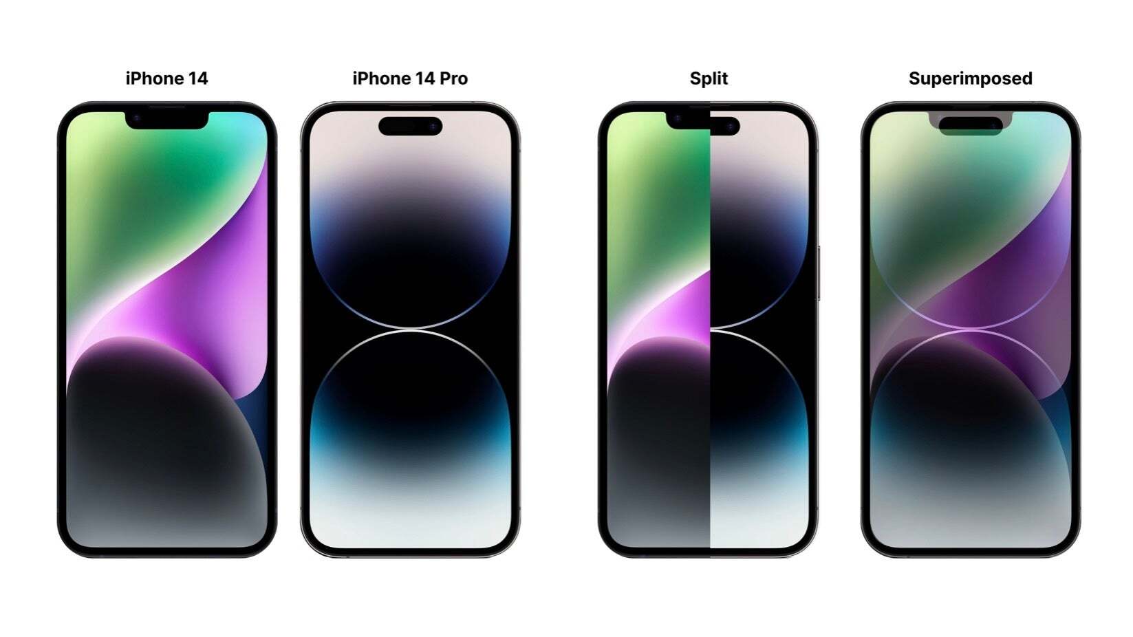
Apple iPhone’s Dynamic Island cutout vs notch screen area
In short, what Apple giveth in reducing the screen bezel width, it did already take away with the Dynamic Island. Nominally a boost to the iPhone’s screen-to-body ratio, the visible pixels above the screen holes are pretty much unusable.
The Dynamic Island sits lower than the lowest part of the notch before it. While it takes less width than the notch, allowing for some cool notification effects that hide its provocative design decision, it actually occupies a tad more vertical space overall, especially with third-party apps that are not optimized to display anything in the few pixels above it.
Apple can’t backtrack on Face ID now, though, so the thinnest bezel record of the iPhone 16 Pro Max would likely ring hollow until Apple finds a way to bury the Dynamic Island hardware below the screen, at least partially.
#Apples #iPhone #Pro #Max #bezels #sight #behold #pleasure #hold


