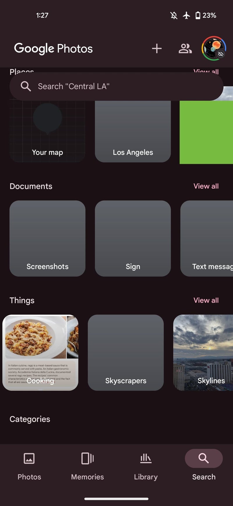
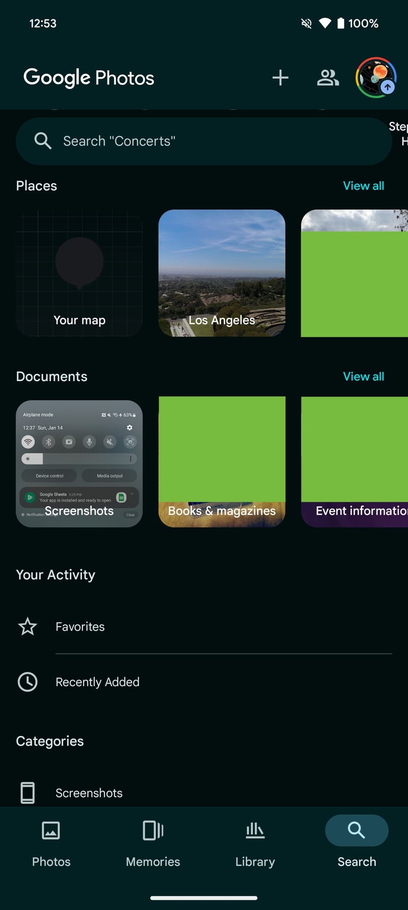
Previously, the Search tab in Google Photos hosted four carousels, namely People & pets, Places, Documents, and Things. The “Things” carousel served as a handy way to group and explore photos based on various categories like Selfies, Skylines, Concerts, and many more. Users could view a subset of these categories directly on the carousel, or access the full list through the “View all” option.


Old vs New look | Credit: 9to5Google
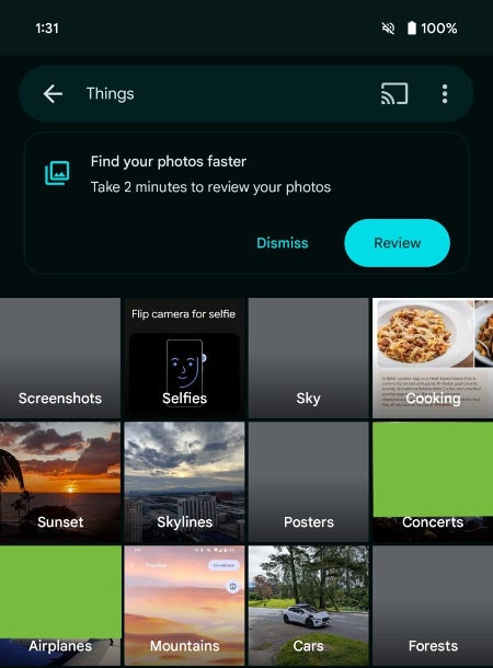
While the removal might disappoint some users who enjoyed the convenience of the Things carousel for passive browsing, the categories are not entirely gone. Users can still access them by directly searching for “Things” within the app, which will lead them to the familiar full-page grid view.


Credit: 9to5Google
According to 9to5Google, this minor adjustment could be part of a larger plan to revamp the Google Photos interface. With the impending arrival of “Ask Photos,” it seems Google is streamlining the app’s features and layout. However, it’s important to note that the version presented at I/O 2024 is not the final design. For instance, the “Library” tab still exists, although Google has been experimenting with a “Collections” revamp.The removal of the Things carousel may be a minor change in the grand scheme of things, but it marks a shift in how users interact with the Google Photos app. With the introduction of Ask Photos and potential future updates, the app is in a position to evolve, offering users new ways to search, organize, and rediscover their photos. It will be interesting to see how users adapt to these changes and what further refinements Google has in store for its photo management platform.
#Google #Photos #ditches #carousel #prepares #Photos #feature


