One area where we’ve had multiple leaks and rumors so far is the design of the phone. We’re hearing about a familiar change with a vertical camera alignment on the back, and now, we’re hearing that Apple’s working on slimming its bezels.
That has me thinking that basically no brand new or exciting design elements are expected. Have we reached the “perfect” iPhone design?
iPhone 16 with slimmer bezels
A recent rumor is talking about Apple using a new technology to achieve slimmer bezels on the iPhone 16. The tech is called BRS, or Border Reduction Structure. There are already methods to ensure slimmer bezels on the top and side, and this new tech is said to help slim down the bottom bezel.
As you can see, the iPhone 15 and Pro bezels are already quite thin. The Galaxy S24 and S24 Ultra are here for reference as well, so you can get a glimpse of what the competition is doing. However, I’m here to argue that this minuscule difference we have between the iPhone bezels and the Galaxy bezels is only noticeable when you are hyper-focused to find it.
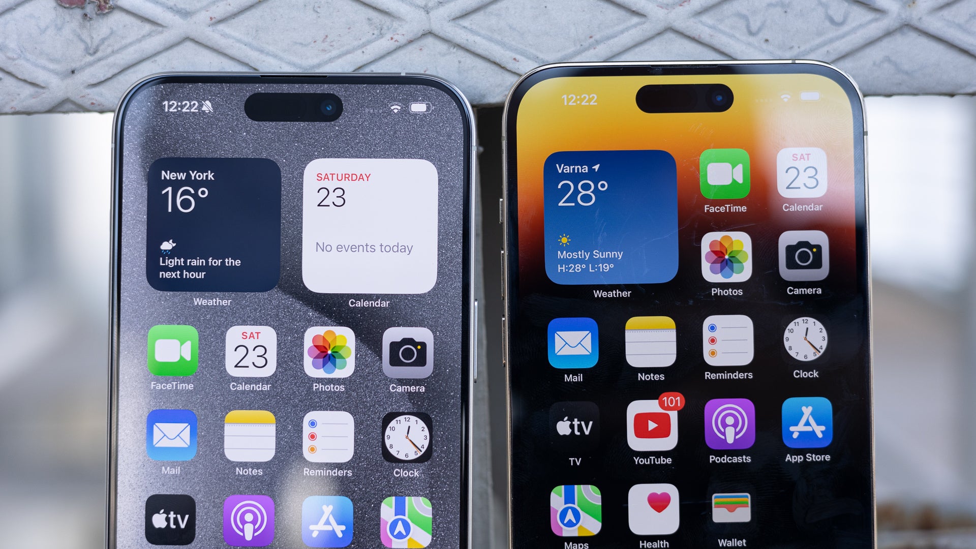

The iPhone 15 Pro Max and the iPhone 14 Pro Max
In real life, you’re still likely to confuse someone else’s iPhone (even if its another model) for yours. Plus, you don’t stare at the bezels of the phone so much: most likely, you’re instead focused on whatever it is you’re doing on your phone.
Now, look at the iPhone 15 Pro Max and the S24 Ultra. For now, we’re focusing on the bezels only (I’ll talk about the Dynamic Island later on).
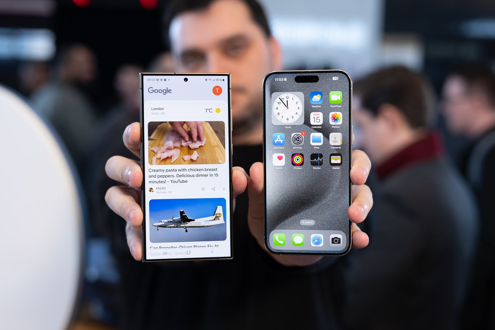

iPhone 15 Pro Max and Galaxy S24 Ultra
I bet you don’t see a difference in bezel size! And even if Apple manages to make the bezels even slimmer, I’m arguing the difference isn’t going to be dramatic. The only more dramatic difference we can see would be if Apple would remove the bezels altogether.
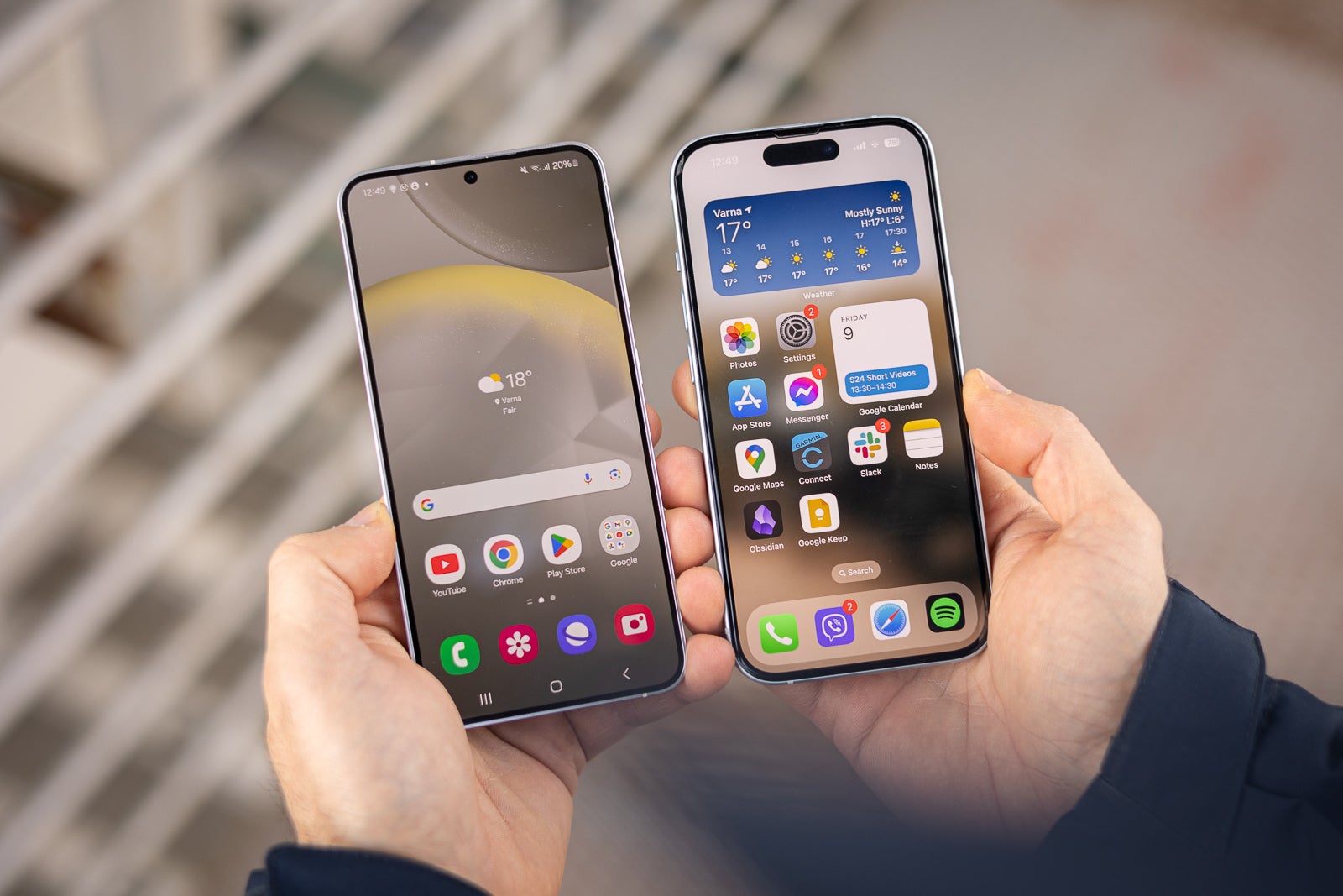

The iPhone 15 and the Galaxy S24 – a teeny tiny bit of difference is noticeable on this photo
All that is comes to illustrate that a change that slims the bezels a tiny little bit more isn’t that big of a design change.
iPhone 16 camera alignment: is reverting back to an old design considered a new design?
You’ve all probably heard the rumors about the “new” camera alignment on the iPhone 16. We hear the camera lenses will be positioned under each other instead of diagonally like on the 15. That change is rumored to be needed for spatial video recording for the Vision Pro that Apple is trying to make a thing.
But is this design really new? You probably know it’s not. We have it on the iPhone 12. A slimmer island would be similar to the iPhone X.
So this design isn’t anything new and dramatic. If it ends up happening, it will be for practical purposes, not just for the looks.
Has Apple found the perfect iPhone design?
Many people tend to point the finger at Apple for the lack of innovation in their designs. But is this really due to just being late to the party? Or has Apple found a design that… just works?
Over the years, we’ve had incremental changes to the design, but nothing dramatic. Apple is in refinement mode, instead of experimentation mode.
For example, 2023 Pro iPhones came with titanium replacing the stainless steel frame. This change in design didn’t bring anything dramatic to the looks of the device, except for colors (but I don’t really consider colors a design change, per se). The titanium frame, however, was introduced with the main aim to help with weight.
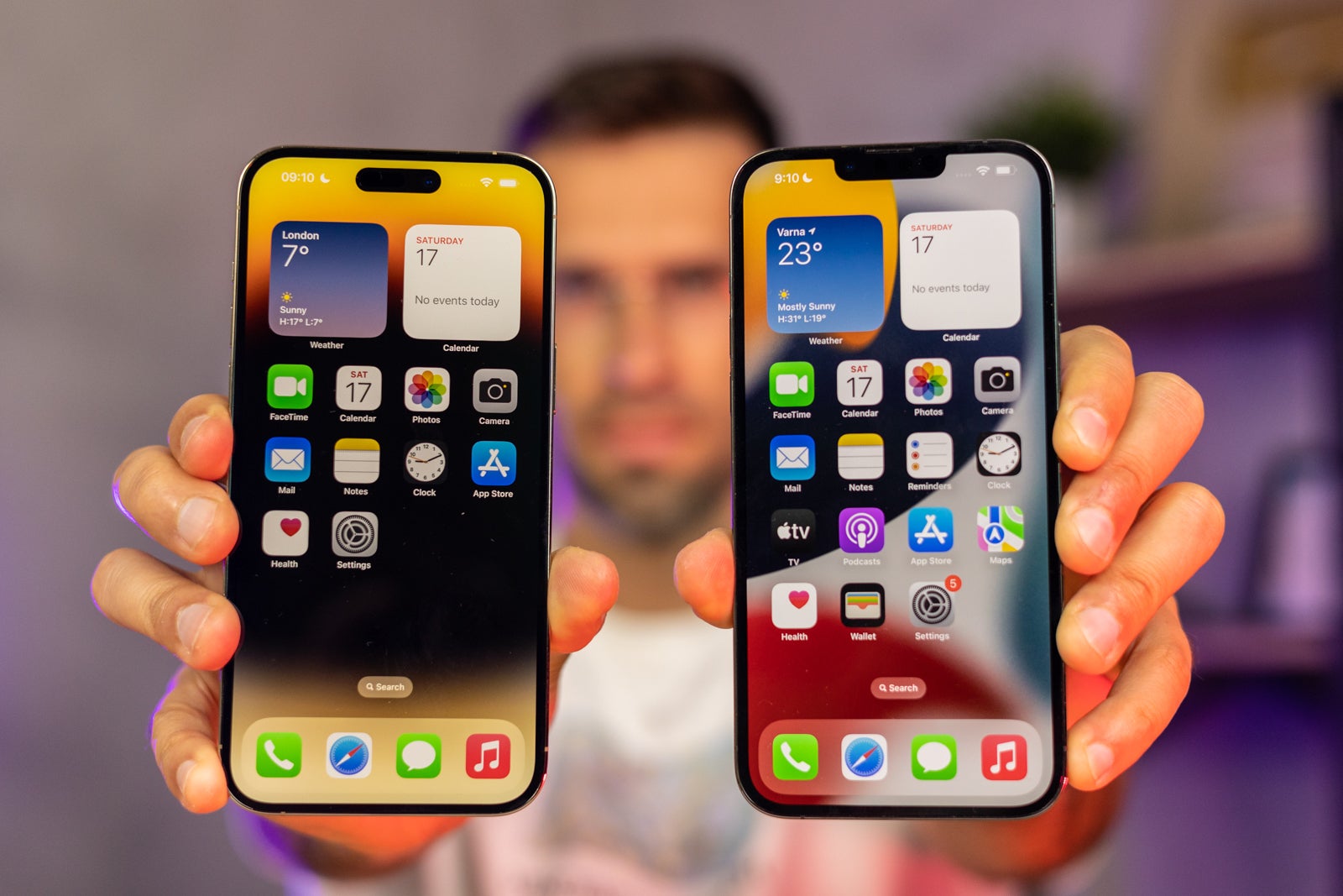

The iPhone 14 Pro Max with Dynamic Island and the iPhone 13 Pro Max with the notch
The rest of the changes in the iPhone design over the last few years were minimal. All in all, you notice these changes when you search for them. If you’re less focused on noticing design differences, they’re almost… nonexistent.
The quest for perfection
Of course, nothing is perfect in life. And neither is the iPhone. Apple has at least a couple more things to work on (design-wise) to get itself even closer to perfection.
First off, we have the Dynamic Island. It does have some features (like showing notifications or Face ID check), but it’s… well, there. If we were to want a perfect iPhone, we’d want it to be gone.
But if it didn’t have to be there, it wouldn’t be there, as Apple’s design generally focuses on simplicity and clean premium-ness.
Another thing that Apple may be looking into for a perfect iPhone is a bezel-less iPhone. Reports claim Apple is looking into ways to get rid of the bezels completely, and also looking into UPC (Under Panel Camera) for future models. But those are still rumors. But even so, my bet is that a bezel-less iPhone will look very similar to current iPhones. Yep, without bezels or Dynamic Island or what have you. But will still likely be a ‘glass sandwich’ with a similar display ratio and sizes.
All that is to say is that Apple may have reached the limits of phone design, and the iPhone is near perfect for its materials, features, and use case. I’d reckon the next big step in the way mobile tech looks is something that doesn’t look like a smartphone at all. So maybe a ring, or smart glasses, or a chip under your skin. Whatever it is, I believe it’s not going to be in the shape of a phone anyway.
#iPhone #design #wont #reached #perfect #iPhone


