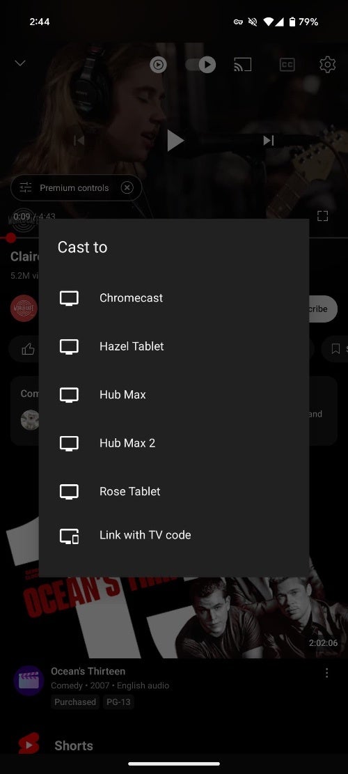
Previously, tapping the Cast icon would open a prompt in the middle of the screen, allowing users to select a device. During an active casting session, this button offered volume control, while options like Voice search and Remote appeared for compatible televisions. Additionally, there was a prominent “Disconnect” button located in the bottom-right corner for easy session termination.


Credit: 9to5Google
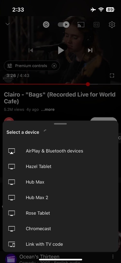
The new “Select a device” menu, however, doesn’t span the entire screen width. Once playback starts, a thumbnail of the playing content appears, along with voice and remote buttons in the corner. Users can switch to a different device at any point using the “Select different device” option.


Credit: 9to5Google
While this redesign aims to streamline the casting experience, it’s not without its drawbacks. As noted by 9to5Google, a common complaint among users is the absence of the familiar Disconnect button. To end a casting session, users now need to tap “This phone,” which transfers playback to their mobile device, followed by manually pausing the content. This two-step process is less convenient than the previous one-click Disconnect option. Despite this inconvenience, there are alternative ways to stop casting, as users can make use of the Google Home app or the Android media switcher to terminate a session.The rollout of the new Cast menu hasn’t been widespread, with some users on iOS and Android already seeing the changes while others haven’t. This suggests that the update is being gradually implemented and may not be available to everyone immediately. As the rollout continues, it remains to be seen whether YouTube will address the user feedback and potentially reintroduce the convenient Disconnect option in a future update.
#YouTube #app #rolling #redesigned #Cast #menu #lacks #Disconnect #button

