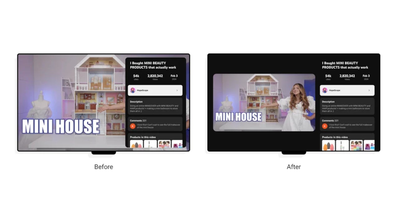
The main change is the reduced size of the video player, which is meant to simplify interactions. In addition to the visual changes, the new design will include a broad range of new experiences such as shopping and viewing live scores, as well as improvements to existing functionality like accessing video descriptions and comments.
Before deciding what to actually change and what to keep in the new design, YouTube tapped into user feedback provided by long-time users, and here what the service learned:
- The new design works for features that require equal or more attention than the video itself (e.g. comments, description, live chat) but obscuring the video would be detrimental to the viewing experience.
- We need to continue to prioritize simplicity over the introduction of additional lightweight controls.
- A one size fits all solution may not be the best approach, as features such as live chat and video description benefit from different levels of immersion.
The end result “keeps the video front and center, but layers in the ability to access the features that make YouTube unique – all without interrupting the viewing experience.”The bottom line is the new experience focuses on the ability to read through comments and video description while still having the video player in front of your eyes. It’s an interesting concept that will allow YouTube TV subscribers to explore Views without disrupting what they’re watching.
#YouTube #reveals #design #app


